The Colors of Neutra
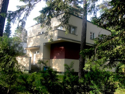
The quartet of small houses Richard Neutra designed in 1922 are located on Onkel Tom Strasse in Zehlendorf, a quiet, leafy, well-to-do Berlin suburb. Known as the Adolf Sommerfeld Residences, they were named after the rather eccentric developer who built them. (Sommerfeld proposed, and Neutra drew, a giant revolving turntable with three partitions, containing, for example, a piano in one section; a dining room table with places already set in a second; and a sitting area in the third. The massive mechanism, smack in the middle of the really-not-so-big living room, was a decidedly novel way to address one of early Modernism’s eternal quests: making space work harder for everyman. The more predictable approach to reconfiguring space would be sliding walls or curtains, seen in any number of German and Dutch experiments such as the Rietveld-Schröder House, Utrecht, 1924. On Onkel Tom Strasse, one turntable actually got built; alas, it is no more but the mechanism below the floor may be.)
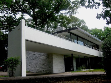
Neutra designed these compact dwellings while his employer, Erich Mendelsohn, was working in Palestine. The four exemplify how Neutra could animate a potentially stolid, solid, white cube: a type pretty much the antithesis of his later command in completely eliminating a “box” in favour of exquisitely proportioned planes of glass, metal, stone, or stucco, all sliding past each other or into the landscape in a complex balance of asymmetry. The Zehlendorf boxes have deep punctures of solid and void befitting these sturdy houses. But even here you can see some of the gestures that would become much more emphatic in Neutra’s later work, such as elongating planes or extending a plane to wrap around a corner to create a balcony, something similar, if more tentative, than the jutting momentum of the Lovell Health House pool.
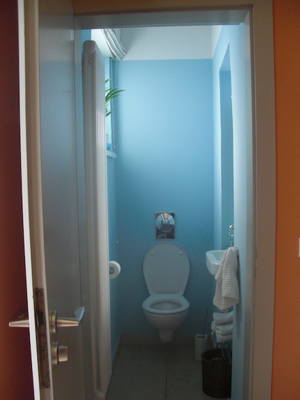
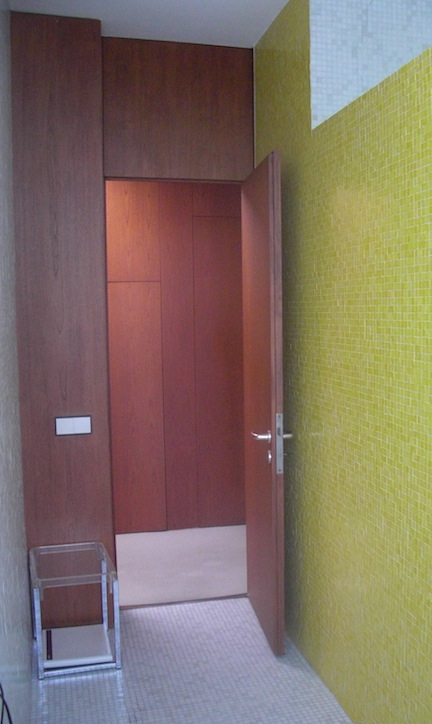
No, it’s what’s inside these houses that took my breath away and off my white-walled perch. Rooms are defined by hues so rich one feels saturated in color even after one leaves and steps back into the sunlight, like a musical chord that keeps resonating. And in contrast to his later deployment of a single plane of a color or material that continues from the inside to the outside, passing through glass to extinguish the boundary between exterior and interior, here in Zehlendorf the colors define space as discreet containers, as filled volumes, not as planes.
His use of color [update 3 Oct. 2013: it appears that the developer, not Neutra, chose the interior colors.] here reminds me of Le Corbusier’s Color Keys or, especially, Bruno Taut’s Berlin housing, beginning with his “Paint Box Estates” aka Falkenberg Housing, 1912.[1] Taut’s later manifesto of 1919 defends color without apologies, and just as capable as white in combating “the dirty grey” of houses:
“We do not want to build any more joyless houses, or see them built… Colour is not expensive like moulded decorations and sculptures, but colour means a joyful existence. As it can be provided with limited resources, we should, in the present time of need, particularly urge its use on all buildings that must now be constructed. We categorically denounce the absence of colour even if the house is in the midst of nature. There are not only the lush landscapes of spring and summer, but also the snow-covered scenes of winter, which cry out for colour. Let blue, red, yellow, green, black and white radiate in crisp, bright shades to replace the dirty grey of houses.”[2]
As Peter Davey has pointed out, “Taut believed that color was also necessary because ‘it was a social duty of the architect to offer the inhabitants of social housing schemes an identification with their relatively modest living environment through the use of colour.’ Thus, he was calling for color for two reasons: one, for its ability to precipitate an emotion, in this case joy, and the second because color was a superb way in a chaotic, war-torn environment to weld emotional connections to the environment.”
Neutra would go on to dedicate his life to calibrating the psychological and physical, the emotional and the perceptual, in his architecture. He discussed color in Survival through Design in the chapter, “Light and Color Experience in Static Interiors”:
“The strong vivid colors in nature, like those of an impressive evening sky, would become hard to bear if viewed indefinitely; here the factor of fatigue appears operative. Undoubtedly, steady uniformity needs to be offset – just as seasonal change is an important element in our enjoyment of nature … The brightest reds and yellows in nature are not commonly found over extensive areas, or, if they are, they do not appear for prolonged periods of time.”
He then went on to discuss “bright xanthophyll,” that colors autumn foliage; the role of “red hemoglobin” in “hunting, war slaughter, and bloody murder,” and the “great exception,” chlorophyll: “Through countless millions of years animal and human retinas have been conditioned to tolerate immense expanses of green. Eyes have grown to relax in full view of them. A similar prevalence of bright yellow or red would indeed be unbearable.”
As far as I know, Neutra never used color so emphatically, defining volumes, as is seen in Zehlendorf, but instead in the spirt of what he advocated in Survival. That is, more typically he employed white and a deep, cold brown, a color so typically seen in his later work that I call the paint “Neutra brown,” when he wanted spaces to project (white) or recede (brown), a basic technique of Gestalt aesthetics. There is a fine story Dr. Stuart Bailey told me once about consulting Neutra on his Pacific Palisades home, Case Study House #20, 1946. The young Dr. Bailey was a dentist, who, one assumes, appreciated good light to see detail. He asked Neutra if the closet interiors could be painted white, to see things better, rather than dark. Seems a reasonable request. “Mr. Bailey, “ Neutra said sternly, “The closets must recede. If you paint them white, I will remove my name from the project.” The closets stayed dark. (Neutra also threatened to commit “public suicide” if trees were removed from a school property. The trees housed birds, which pooped on faculty cars. Neutra won that one, too.)
But the color that far and away most recalls Neutra is silver, no matter the decade, seen especially on wood trim such as window sills, posts, or on steel windows. Paint protected either material, of course, but silver, of all the colors, “dematerialized” these elements and dispersed light.[3] If glass technology couldn’t yet deliver the large spans of glass so prevalent in early and mid-century post-and-beam architecture, then the requisite framing members of smaller expanses of glass could best be visually suppressed by using silver; such suppression would aid the human eye to connect to the landscape beyond with as little impediment as possible. Light and space, whether considered mystically or scientifically, were vital concepts in the religious philosophy Theosophy and to Dutch Functionalist architects such as Leendert Cornelius van der Vlugt, principal architect of the famous Van Nelle Factory, 1929, and of the equally famous house he designed as principal in Brinkman and Van der Vlugt for Cornelius van der Leeuw, a rich industrialist, Theosophist, and rigorous Modernist who commissioned the light-filled factory, which, beyond mysticism, pragmatically encouraged worker safety and productivity.

Van Nelle Factory, Rotterdam, 1929. Leendert Van der Vlugt and Johannes Brinkman for Cornelius van der Leeuw. Photo by bml.
His Rotterdam house, with its exterior white walls and silver trim (with plenty of color inside), faces the lake at Kraslinge Plas, just as the Neutra family home, the white-and-silver VDL Research House I, 1932, and II, 1966, designed by Dion and Richard Neutra, face the Silverlake Reservoir in Los Angeles. Neutra named his own house after Van der Leeuw because he loaned the architect $3,000 to build his own house.[4]

The white-and-silver Kun House 1, Los Angeles, 1936. Photo by Luckhaus Studios and used courtesy of owner.
Neutra often left colors for a wall or two up to the choice of his clients. In the Olan and Aida Hafley House in Long Beach, the clients chose a salmon and persimmon for the two walls of the master bedroom … but on the north wall, below the full-width band of casement and fixed windows, was Neutra brown while the ceiling was white. The unchanging, stable brown (also used in the closets, to make them recede) and the white play Renaissance to the colors’ Baroque.
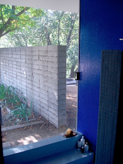
In the Taylor House, Glendale, 1964, the walls of the bathroom were beautiful gradations of darker blue offsetting lighter yellow green, a precise color scheme that project architect John Blanton created after much trial and error, based on the client’s general wish for blue and green in the two bathrooms. While the colors in the bathroom are original, the current owner replaced the tile in each, with equally beautiful results. In the master bathroom, one can slide the glass wall away and commune directly with the groundcover’s dark, glossy greens and the rough bark of the oak trees just outside of the sunken shower/tub … talk about sensual.
In another home, and I honestly forget which one, Neutra was led to a then-unpainted bedroom wall by the little daughter of his clients. It was to be her room. “What color would you like?” he asked, looking down at her and her turquoise snow jacket (the ones many little girls wore in the ‘50s and ‘60s, usually with hoods trimmed with fake white fur.) “Would you like the wall that color?” She was delighted.
In the Pescher Villa, Wuppertal, Germany, 1968, the bright yellow tile in a bathroom lifts one’s spirits on an overcast day so typical of the area. Outside, the entrance to the house would be merely soberly commanding without the red-painted steel work. But it wouldn’t be lively. Here the color’s task is to knit the white and “Neutra brown” stucco planes, glass, and grauwache sandstone walls into a crisp, harmonious composition.
In an undated, one-page, typed paper titled A Colorless Building Or Sculpture Is An Abstraction Which Was Not Known To Early Man And Particularly Not The Greeks, Neutra wrote this on color:
Color was – as in nature – a part of form, formal solution, and formal proportion. Color was no afterthought or afterchoice. It was – as it is in the reality of physiological and psychosomatic experiencing – “part and parcel.” I saw in Agrigentum[5] a temple with the triglyph and metope-frieze lacking, and it looked in better proportion to the columns, than with the frieze that had been spared on the other front of the ruin. Suddenly it dawned on me that I had – on the other side – been looking at a colorless remnant. No more were the red triglyphs between the blue “holes” of the metope against which the reliefs had been eliminated. All proportions had changed!”
Of course, it was actually the great German architect and theorist, Gottfried Semper, who drew attention to the Greeks’ use of color in temples. Pigment and paint could become a “bodiless coating” that permitted a dematerialized architecture of pure form, Semper’s highest ideal, as scholar Harry Mallgrave has pointed in his biography, Gottfried Semper: Architect of the 19th Century.
Color, whether in architecture or nature is a powerful tool to alter perception and mood, as any hospital designer, artist, graphic designer, etc. etc. can attest. It is an endless topic. When Neutra wrote about color and eye fatigue over half a century ago, it was a different world than our modern urban paradigm today, in which visual jinglejangle is unrelenting. Perhaps such stimuli will become our own chlorophyll, given evolution and some tens of thousands of years.
[1] Sean Kisby, Welsh School of Architecture, quotes from Taut’s “Call” in his essay “Bruno Taut: Colour and Architecture,” http://www.kisbee.co.uk/sarc/taut/taut.htm. See also “True Colours: The glorious polychromy of the past suggests a strong historical need for colour, despite current reductive fashions – color in architecture,” by Peter Davey in The Architectural Review, November 1998.
[2] Kisby.
[3] See my essay, “Silver Paint, the Dutch, and Japan,” in Richard Neutra – Complete Works (Taschen, 2000.)
[4] Neutra paid him back, with interest, by 1947, his widow Dione told me. Through the previous decade, the capitalist reminded the architect of his very modest loan: revealing the pragmatic Dutch sense of making capital work.
[5] An ancient Greek city in Sicily where there are several Greek temples which have been preserved, now a World Heritage Site.










Keep up the great insightful work Barbara. Very interesting analysis.
LikeLike