“Untamed Orange”: Schuller, Neutra, and Semper at the Garden Grove Arboretum
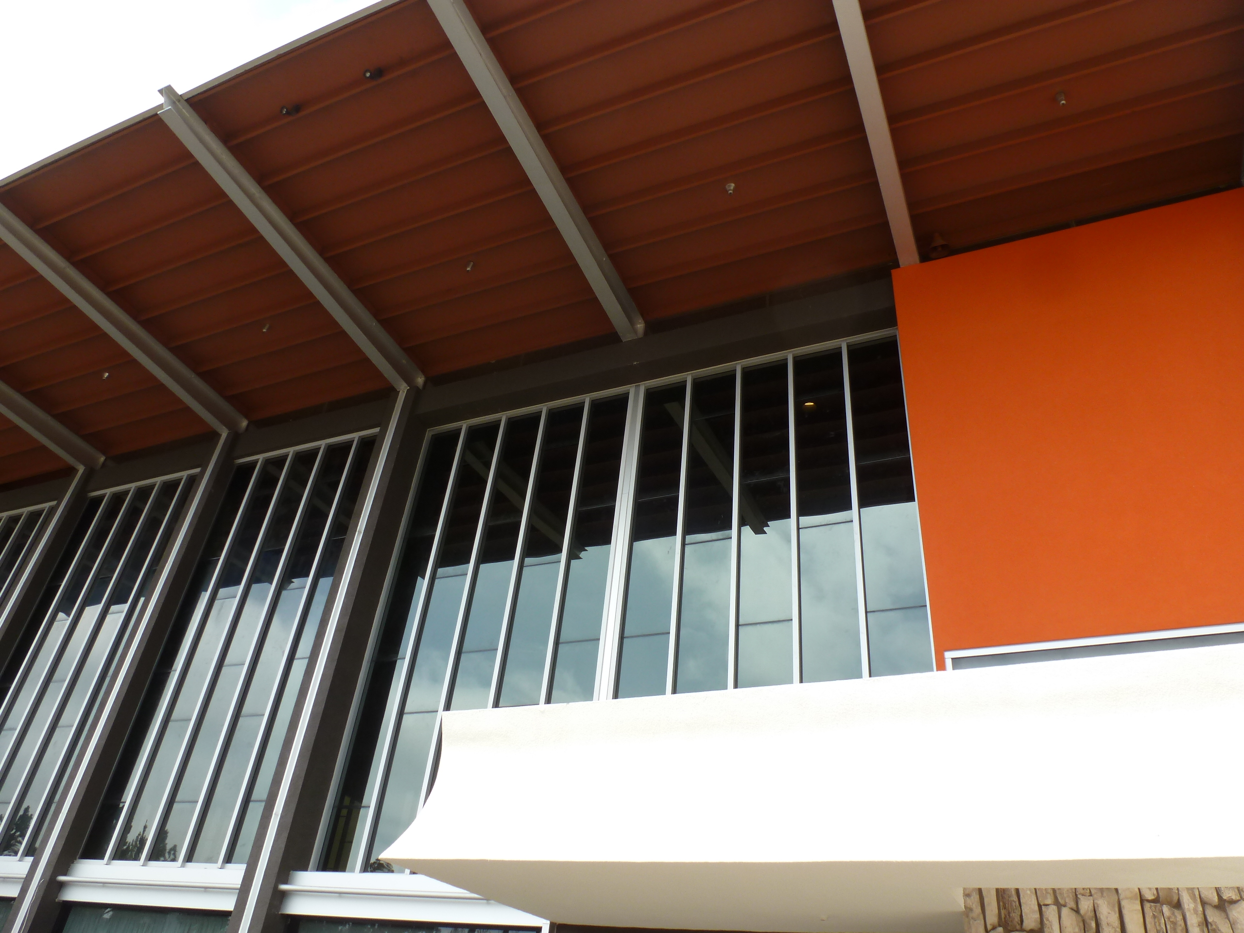
East Facade with new “Untamed Orange” panel, the former Garden Grove Community Church, now “The Arboretum,” part of the campus of Christ Cathedral, Roman Catholic Diocese of Orange. Photo by B. Lamprecht
Throughout the entire campus of the former Crystal Cathedral there is only one single note of color on a building. A large orange panel terminates the long length of glass on the east face of the former Garden Grove Community Church, the famous “drive-in” church designed by Richard Neutra (1892 – 1970) in 1960 and completed in 1961. It faces the entrance on Lewis Street and the famous parking lot where the evangelist of the Dutch Reformed Church in America, the Rev. Robert Schuller (1926 – ), preached to families parked in their handsome steel boats, those long mid-century cars recalling a different America. The decision to restore orange after decades of absence speaks, ultimately, to a trust as bold as the color itself: trust in the architect who chose it, trust in the decision to bring it back, trust in this version of the color, and trust that the public and new church goers would accept it. Redemption and rebirth are words that are just as acceptable in preservation as in theology.
Color in Modernist architecture has always been problematic. There are scores of seminal examples of the use of color by iconic architects, but these are mostly known only by cognoscenti. The “painted ladies” of Victoriana and the brilliant terra cotta tile of Art Deco notwithstanding, for public buildings architects generally leave color to the interior, to ephemeral flourishes, or to the landscapers. Earlier centuries didn’t have it much easier. In 1835, the mighty German architect and theorist Gottfried Semper was commissioned to redesign a royal palace interior in Dresden. The rooms were to showcase Greek and Roman antiquities. Semper, young and untried in the powerful art circles of sophisticated Dresden, changed very little spatially. What startled his audience, and ensured considerable buzz, was his use of color. He saturated panels with color as a backdrop to the marble sculpture, typically human figures in some fluid motion.[1] Even if his peers were dismayed by his impudence, no one could deny that the statues were far more dramatic against the strong colors. They popped!, we’d say today.
Semper was among those who championed the controversial new view that Classical temples were not bone white, as traditionally understood, but sharply distinguished by color. And these colors were not just subtly toned down hues or pastels (which might have made them palatable, if grudgingly) but brilliant blues, reds, yellows, greens. Such an unapologetic palette contradicts most architects’ long-standing preference for a repertoire of balanced neutral colors complemented by a range of textures and shapes, a love that owes a great deal to beautiful old grainy rich black-and-white or sepia photographs of ancient temples like Paestum or Mies van der Rohe’s Barcelona Pavilion. Creams, whites, blacks, browns, silvers, earth tones. Perforations, striations, rustifications. Not primary colors, especially next to one another as Semper advocated. How vulgar.
Certainly those preferences are evident at the Christ Cathedral Campus, now owned by the Roman Catholic Diocese of Orange. Throughout the roughly 34-acre compound, the colors and materials are Modernism’s standard palette. There is the crisp delineation of board-formed concrete at the Tower of Hope, designed by Richard and his architect son, Dion, completed in 1968. There are the 35,000 square feet of glass in the “Cathedral” of Hour of Power fame, designed by Philip Johnson and John Burgee, completed in 1981. There are the embossed stainless steel panels of the “International Center for Possibility Thinking,” (a visitor’s center, café, bookstore and museum) designed by Richard Meier, completed in 2002.
Early this summer, the developer, the Christ Catholic Cathedral Corporation (CCCC), asked me to help on various aspects of the original design as they rehabilitated the sanctuary, including the missing orange panel. To do that required recalling the purpose of the panel. Why was it there in the first place?
Neutra’s building is literally overshadowed by Johnson’s celebrated glass building just across the entrance to the north, and is likewise overshadowed in popular culture. However, the smaller church is far more complex as a study in asymmetry and contrasts in light and dark. It is a slender pavilion supported by narrow steel columns that add rhythm to the tall bays of glass comprising the long facades. Years ago, the church was famous in its own right because of an outrageous move Schuller made and Neutra implemented. This was an act of pure theatre, embodied in the long white-painted platform extending from inside to outside of the church. The platform is essentially an elongated pulpit stretching beyond the building envelope, about ten feet above the ground plane, where large glass doors slid open to the outdoors.
Striding back and forth, physically enacting how fluid the relationship between indoors and out could be, the platform allowed Schuller to address the congregation in the nave (embodying the traditional collected body of worshippers), or the other, new, foreign, paradigm: people parked in their cars. Every parking space was equipped with a free-standing speaker, not much different than the speaker you’d lean into to buy an A&W root beer float back in the day. Going to church without leaving your Chevy: only in America, only in Southern California, only in a car culture, only in the land where the individual trumps community: Schuller preached the positive gospel of individual self-esteem. Architecture could help propel that message, especially an architecture that was intended to further well-being, as Neutra argued his did.

Los Angles Times, Nov. 12, 1961. Rev. Schuller was accompanied by the Rev. Norman Vincent Peale.
Neutra himself long practiced architecture as an act of perception. He employed a repertoire of psychological strategies in his architecture. These were part of his philosophy of “biorealism,” which harnessed human biology, especially cognitive sciences and evolutionary biology, to realize the effects he desired in his architecture. With regard to this most theatrical event, the robed pastor addressing a sea of cars, the architect’s goal was to attract one’s eye immediately to Schuller. How to do it? Neutra employed Gestalt aesthetics, especially “figure vs. ground,” a form against a backdrop. This was a technique he had learned decades earlier and refined at the Bauhaus in 1930, when Neutra taught there in 1930. Thus, although the Arboretum, as Neutra’s building is now called, is so emphatically a formal, glass well disciplined into a clear arrangement of rhythmic bays, a single opaque wall section of ORANGE suddenly terminates the east wall. Obviously, this move recalls Semper’s own strategy at the Donner Pavilion in Dresden, where he, too, dramatized a marble human figure in motion, against his own panels of color. Both architects employed color as a theatrical device.
Neutra’s panel had been removed long ago. When, no one knew. It was replaced with glass to match the existing glass bays, though the new glass was reflective to resist heat gain, revealing its non-original character. The loss of the panel indicates that the original, historic orange panel was unwanted – even though it directly blocked the sun. It didn’t match the preconceptions of the Neutra they knew, or wanted to know.
I found no color swatch or specification in Neutra’s archives. The few photographs available didn’t really help either, especially the ones taken at sunset when the whole building was bathed in amber. One image did show the orange in daylight. The expert paint analyst, Patti Grant, did deliver a fine match based on little physical evidence. Even so, should we reinstate this exact orange?
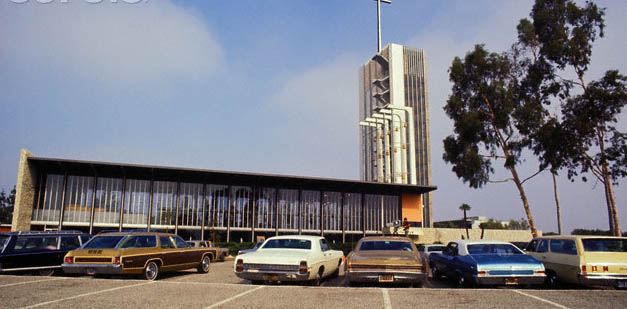
Garden Grove Community Church, late 1960s/early 1970s.
The initial orange alternative was mute, in a way, and reminded me of freeway safety vests. It had little to say about the radical offer of redemption, which was, after all, the point of all this effort. I wanted to find an orange that acquitted three briefs: First, find an orange that met the Secretary of the Interior’s Standards for Rehabilitation, whose guidelines include, “Where the severity of deterioration requires replacement of a distinctive feature, the new feature will match the old in design, color, texture, and, where possible, materials.” (The proportions, design, what could be discerned about texture, and an updated, robust material, all were in carefully replicated.) Second, find an orange that articulated Neutra’s convictions about the role of vision and cognition, emotion and the senses. It had to convey his shrewd exploitation of color and his keen knowledge of its powerful role in affecting perception: everyone thinks of “Neutra Brown,” “Neutra Silver” and “Neutra White,” but few associate Neutra with orange, or persimmon, or yellow, or teal, all of which he used with flair, just as other Modernists from Taut and Le Corbusier to Wright and Schindler did. [2] Neutra alluded to Semper in one of his books, and seeming to recall Semper’s own views on color, after a trip to Sicily and Greece he wrote:
Color was – as in nature – a part of form, formal solution, and formal proportion. Color was no afterthought. It was – as it is in the reality of physiological and psychosomatic experiencing – “part and parcel.” I saw in Agrigentum a temple with the triglyph ad metope-frieze lacking, and it looked in better proportion to the columns than with the frieze that had been spared on the other front of the ruin.[3] Suddenly it dawned on me that I had – on the other side – been looking at a colorless remnant. No more were the red triglyphs between the blue “holes” of the metope against which the reliefs had been eliminated. All proportions had changed!”
Third, find an orange that could meet the liturgical needs, rituals, vestments, and ornaments of the Catholic Church. What would be an appropriate backdrop to those moving priestly figures, to those embellishments? The fountains symbolized the cleansing water of everlasting life, the 12 original jets embodying the 12 apostles. What could portray, for example, John the Baptist’s prediction about Jesus; “He will baptize you with the Holy Spirit and with fire …” and in the Psalms, where David notes that God’s ministers were “a flaming fire,” to quote only a few of the references to fire in the Bible. What orange could be a welcome participant throughout the liturgical calendar, which relies on colors to notate significant events, holy days, or periods for the Church: white, purity; red, blood; black, mourning; violet, penance; and the warm green of “Ordinary Time,” that is, most of the church year.
And perhaps it goes without saying, but after all, this is Orange County, and the Roman Catholic Diocese of Orange.
So I looked for an orange that had the ability to resonate with all those issues. If used, the freeway safety orange would, I thought, displease and disappoint the Church and embarrass the truly astounding efforts of the developer, the architect, and the builders. I went through sample decks from four manufacturers, weighing and thinking … well, it’s only paint. It is among the most “reversible” of treatments to historic structures. Finally, I found one, and to my delight (I have to admit), its name was “Untamed Orange,” which could speak either to ignoring established hierarchies but in a larger sense, refer to the unbridled generosity of God’s love for the world.[4] In any case, it was a fiery orange, the kind of color that would lift the spirits on a grey and rainy Sunday morning in February, or match the color of a rising or setting sun.
Schuller himself commissioned Neutra because both men were visionaries, embarking on uncharted territory, he believed. “There was a mutual chemistry,” Schuller remarked in a 2009 interview. “We were both driven by a compulsion to excellence. Neutra was fascinated by something that was different (the drive-in concept.) ‘I am not a Modern architect,’ he said. ‘I am a Classical architect. I deal with space and light and the emotions,’ ” Schuller recalled. “We talked often. What does a human being need? How does architecture relate to self-esteem? How can design be in harmony with Nature?” Schuller also recalled the sense of serenity and peace in the church, a quality that the evangelist Norman Vincent Peale remarked on as well.
Long after the church was completed, Schuller and Neutra remained close, especially during Neutra’s bouts of depression in the late 1960s, when he sought the minister’s counsel. In private, there was an intense communion between two highly intelligent men who were equals as figures who shifted the trajectory of the 20th century. In public, they were lions of men. Each parsed their vision, honing their message, according to their unique audiences, which became one at Garden Grove. Both, I think, had a little “Untamed Orange” in their souls.
[1] Harry Francis Mallgrave, Gottfried Semper: Architect of the Nineteenth Century (Boston: Yale University Press, 1996), 94.
[2] No one knows of Neutra’s use of “lemon yellow or salmon” for part of the primary façade of the Hailey House, Los Angeles, 1959. While long painted over by a bad version of “Neutra Brown,” (a specific shade of brown found in many Neutras, including the Arboretum) we discovered the yellow. It was a sunny yellow, with that straight-ahead frankness so typical of optimistic post-war, mid-century design and culture. After a few misses, I found “Yellow Tulip,” a shade best described as adding three drops of grey, two drops a silver, two drops of white, and a drop of warm green to lemon yellow. Not as innocent as the original, it was more sophisticated, more nuanced, less virginal. Still, it is very yellow, and will be a surprise to those believe Neutra Brown the “appropriate” finish. While it’s rare to see Neutra use color on exterior stucco walls, color was common for certain interior walls: a turquoise at the Auerbacher House, a triptych of greens and persimmon at the Hafley House, and yellow and burnt sienna at the Hailey and Kilbury houses. Like many of his Southern California peers, most notably Buff, Straub and Hensman, one can also find exterior doors painted in a primary color, such as the Perkins House.

Barbara has the skill few architects and architectural writers have to so clearly express in words what architects seek to express in space and volume. Key words and concepts include “trust,” that is trust in the architect to use an unexpected and/or uncommon detail to the benefit of the project program.
LikeLike
Stephen, many thanks for your thoughtful comment.
LikeLike
Very interesting article! As an amateur admirer of the work of Richard Neutra’s work and new owner of a VS Lovell chair, I was intrigued by your comments about Neutra’s use of colour. I am considering the purchase of a cantilever chair and was wondering how broad the colour palate was that Neutra applied to his furniture? Funnily, I suggested to a VS consultant the possibility of French Yellow but was warded off this idea as Neutra would ‘shudder in his grave’. In light of your comments on colour, I wonder if that is true.
LikeLike
Hello Oliver, please e-mail me, I am wondering how you purchased the Lovell Chair and who at VS helped you. Working with VS on furniture, I wrote a book on Neutra’s furniture and its role in his architecture that goes into a lot of detail … but to answer your question, for his own furniture designs he typically specified a range of neutral tones and textures. Best wishes, barbara
LikeLike
Dear Oliver,
Having learned that the expert Nigel Scott-Williams recommended the colour, I would definitely consider it. He has very fine taste … as I said, Neutra typically specified neutrals but loved color and used it well … but sparingly and intentionally. Often color was supplied by “temporary” possessions such as pillows, throws, etc. He had very strong feelings about not competing with Nature, but was more flexible with clients than is usually known. And … if there is a spot of similar yellow out in the garden, you will be establishing an indoor-outdoor connection.
LikeLike
Great Orange color choice! The color choice definitely fosters enthusiasm, stimulation, attraction, & creativity. What better company to display the color Orange than Dunn-Edwards Paints!
LikeLike
Sorry to disagree with you. Weren’t you supposed to be true to the original architect’s vision? With all due respect, I’m wondering why you were allowed to change the colors from the originals. Incidentally, orange used to be my favorite color in my hippy days. But, to the topic, the orange you chose doesn’t match with any aesthetic I recognize. It looks harsh to me. Ugly. I prefer the paler orange in the photo from the 1960s/1970s. I’m a Catholic and an artist; your choice of a color of orange not seen in nature would clash with every vestment color I’ve ever seen. And I have a similar objection about the yellow. Why not stay with the sunny yellow, instead of replacing it with “Yellow Tulip”? What’s the idea of replacing the original with a less innocent color than the original, “more sophisticated, more nuanced, less virginal”? What was gained?
LikeLike